Archive
Kameda Bosai, Old Trees

*
RT has been resolutely ignoring his creative impulses (such as they were) in the face of the many tasks (not the least of which is grieving) that have followed on his mother’s death. Resolutely ignoring, that is, until a spontaneous visit to his local bookstore brought him face-to-face with an alluring poem by Kameda Bosai, a Japanese poet (or rather, scholar and literati painter) that RT had never heard of before. Well, the temptation proved too much for the sterner angels of RT’s nature, and he offers the results of his latest foray into translation below. He knows that mom would approve.
*
old trees crimson at spring’s glance;
waterfalls icy, smash and echo.
imagine a mountain hermit swaying,
collapsing into laughter. water-stars, wind.
*
(Dedicated to Andy and Janet)
*
Image: Confucian Poem, Kameda Bosai. circa 1820-1824. Los Angeles County Museum of Art. WikiCmns. Public Domain.
*
Qi

structure and tension, meaning and motion: we are balanced between absolute truth and pure fluency. poetry. RT
•
RT’s Related Posts: 1) Deer Sanctuary (Wang Wei); 2) Bamboo and Morning Glories
•
Chinese Character: Qi (or as RT is familiar with it, Chi), meaning “natural energy” or “life force.” Author: Kbarends. WikiCmns; Public Domain.
*
*
ART: Drury Brennan Goes Caligraphy Crazy!

*
wow…amazing work… RT
(reposted from URBAN JUNGLE LIFE)
*
Letter to My Father

NIght Calligraphies

*
Simon Lilly strikes again with beautiful words and calligraphy…enjoy! RT
(reposted from simonhlilly)
*
Alphabet mania

I am the Vine

Synethesia: At Play in the Fields of Letterform

RT has long known and admired grass script, a cursive form of Chinese calligraphy that emerged during the Han and Jin dynasties. The transformation from the standard Chinese characters (on the left) to grass script (on the right) epitomizes not only RT’s hope for writing (both sets of these characters say the same thing, but GS with so much more passion and beauty), but even for the world itself.
Readers may object: yes, GS is much more beautiful, but I bet the regular script is a lot easier to read. Good point! How do we take into account the need for communication even as we express our most beautiful self? RT himself has pointed out this problem in a previous post, but now he thinks he’s beginning to see signs of a solution.
Let’s start by considering the humble grapheme, the smallest unit of written in language. There are basically two kinds of graphemes: the alphabetic letter and the stroke that makes up a Chinese (or other logographic) character. What is clear from this distinction is that the Chinese (and others) have paid more attention to the basic shapes of graphemes than we who use an alphabet: they have analyzed their writing into smaller bits: the strokes that make up each word. RT would venture that this has given them greater control of their writing than those using an alphabet can command.
Now, analysis is a powerful thing; it lies at the root of the western scientific revolution and all that has sprung from it. But RT has a hunch that after 500 or so years of using this approach, people may need to start going in the other direction: towards combining things; that is to say, towards synthesis. And in particular, RT is interested in something called synethesia.

Synethesia is a neurological condition in which the stimulation of one sense automatically stimulates a second; for instance, some individuals see colors when they hear a sound. This chromesthesia can be mild (occasional occurrences triggered by certain specific sounds) or chronic (all sound sources trigger an experience of color). Most people with this condition report that it is difficult to suppress the color sensation. And readers, take note: certain of these sound-color associations appear to be shared by not only Synesthetes but non-Synesthetes as well: a high pitch, for instance, is associated with a brighter color tone; a lower pitch, with a darker.
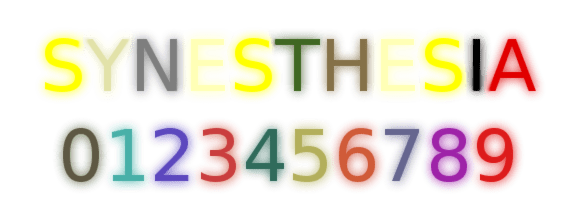
Perhaps the most common form of synethesia, however, involves a link between graphemes and colors. One girl, Pat Duffy, reported that “I realized that to make an R all I had to do was first write a P and draw a line down from its loop. And I was so surprised that I could turn a yellow letter into an orange letter just by adding a line.” And listen to this, from another Synesthete: “When I read, about five words around the exact one I’m reading are in color. It’s also the only way I can spell. In elementary school I remember knowing how to spell the word ‘priority’ [with an “i” rather than an “e”] because … an ‘e’ was out of place in that word because ‘e’s were yellow and didn’t fit.” Imagine the possibilities for helping children learn to read and spell!
What if being messy were a virtue?
The Chinese have long been aware that the moment someone tries to do something correctly, they are far less likely to be able to do it at all. Messiness can be seen as pure energy, and thus at the heart of human endeavor, whatever the field. We need to acknowledge this in both ourselves and our children, to encourage everyone to make connections and associations. It’s not enough to think outside of the box; we must begin joining the boxes together better than they have been in the past.
The possibilities for communication are staggering. What if certain colors were understood to convey specific information and grouped with other colors in a unit that had meaning? What if some of the missing information in grass script was conveyed in its energy and beauty? This would transform writing systems and bring us that much closer to understanding each other.
RT
Images: at top: Cǎoshū Grass script, written in standard and grass script. Middle: Tone-to-color mapping of Scriabin‘s Clavier à lumières. Bottom: Synethesia. All files: WikiCmns; Public Domain.
Letterform–Three Characteristics

*
did j get Ht?
Did you get that? The writing above is a sample of QuikScript, the latest version of the English alphabet invented by Kingsley Read, the important but unsung English calligrapher.
And the alphabet table given to the left is the Ath alphabet, invented by Wurdbender for a constructed language, Barohn, created by Morioka Hiroyuki.
Both of these constructed alphabets raise the important issue of letterform and which forms are best suited for writing a letter. Let’s look at some of the criteria:
1) Direction/Orientation. Look at what the letterform for “i” in the Ath alphabet. Writing this letterform from left to right, people would lift their pen in the direction of the writing itself, thus making it easier to begin writing the next letter. This means that (and here RT is inventing some terms), the letter is right-directed and in harmony with the flow of the text–and thus is much easier to write than a letter that left the hand moving to the left.
2) Shape/Contrast. What shapes are best for creating letters? The main criterion here seems to be contrasts in shape. Look at the letter for “é” in the Ath alphabet. This letterform shows strong contrast between the horizontal top stoke and bottom curved stroke, these strokes being linked by a energetic diagonal. These contrasts make the letter easy to identify and aesthetically pleasing to read. In RT’s book, that means the letterform has a superior shape.
3) Energy. Energy is the personal quality a writer brings to writing down the letter on paper. Does the particular letter written have balance and take advantage of the inherent strengths in the letterform? Does it echo the formation of other letters in the manuscript? Is the spacing between letters and words consistent? All of these things take energy to achieve. An easy-to-read (not to mention a beautiful) passage of writing cannot be penned by someone without the necessary experience and verve.
*
There is more, surely, to know about the characteristics of letterform, and RT will be updating his readers on new discoveries in the evaluation of letterform, with the goal of identifying the easiest and most beautiful letters for writing Engish. RT
*
Ath Alphabet: WikiCmns, Public Domain.
*
Tree & Hill
RT’s Best Hits of 2011

RT’s Best Hits of 2012

Take a Look Around

Mood Indigo


.png)